April 26, 2023

Organizing Your Ink Pads

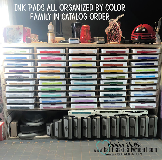
Ink pad organization

 Crafting is a fulfilling hobby that allows us to express our creativity and make something beautiful with our own hands. However, it can be frustrating when we can't find the materials we need or when our crafting space is cluttered and disorganized. That's why having a well-organized craft room is essential to make the most out of our crafting time. In this blog post, we'll focus on one crucial aspect of craft room organization: ink storage.

Inks are an essential part of any crafter's toolkit. They come in various types, including dye, pigment, and solvent-based inks, and are used in a wide range of crafts, from card-making to scrapbooking and even painting. However, storing and organizing them can be a challenge, especially if you have a large collection of ink pads and bottles.

The first step in organizing your ink collection is to sort them by type. This will help you identify the inks you have and the ones you need to purchase. You can use clear plastic bins or drawers to keep your ink pads and bottles organized. Alternatively, you can use a tiered storage system to maximize space and visibility. I personally use Stamp N Storage as well as the Stampin' Up! modular units for my ink storage solutions. 

Another essential aspect of ink storage is to keep them away from direct sunlight and heat sources. Exposure to sunlight can cause inks to fade, while high temperatures can cause them to dry out. Therefore, it's best to store your ink pads and bottles in a cool, dark place. You can also consider using a dehumidifier to maintain a consistent temperature and humidity level in your craft room.

Labeling your ink pads and bottles is also crucial for easy identification. You can use a label maker or create your own labels using a computer and printer. Labeling not only helps you find the inks you need quickly but also prevents confusion when working on multiple projects. And of course Stampin' Up! provides multiple labels for your pads and our refill bottles have a matching color label to make identifying the correct bottle pretty simple. 

Finally, it's essential to clean and maintain your ink pads and bottles regularly. Ink pads can dry out or become clogged if left unused for an extended period. Therefore, it's best to use them regularly or store them upside down to keep the ink flowing. The great thing about Stampin' Up! ink pads, is they are automatically stored upside down when you see the top of the case. It's truly a genius design! You can also use a stamp cleaner or alcohol wipes to remove excess ink and keep your pads clean.

In conclusion, organizing your craft room can make a significant difference in your crafting experience. Ink storage is a crucial aspect of craft room organization, and following the tips mentioned above can help you keep your inks organized, clean, and easy to find. With a well-organized craft room, you can focus on what matters most - letting your creativity flow!

So, get those ink pads organized and Happy Stamping my friends,


April 24, 2023

Color: Complementary or Secondary?


New Colors


Colors have the power to evoke emotions, set the tone for an environment, and even influence behavior. Understanding how different colors work together can help you create a harmonious and visually appealing design or artwork. In this article, we'll explore the concept of complementary colors versus secondary colors, and how to use them effectively.


Complementary colors are colors that sit opposite each other on the color wheel. For example, red and green, blue and orange, and yellow and purple are complementary colors. When used together, complementary colors create a high contrast effect, making each color appear more vibrant and intense.


Using complementary colors in design can be effective, but it can also be challenging. Because these colors are so different from each other, using them in equal proportions can result in an overwhelming or garish effect. To balance the contrast, designers often use one of the complementary colors as the dominant color, and the other as an accent color.


On the other hand, secondary colors are created by mixing two primary colors together. The three primary colors are red, blue, and yellow. When these colors are mixed, they create secondary colors: orange (red + yellow), green (blue + yellow), and purple (red + blue). Secondary colors are less vibrant and have a more subdued effect than complementary colors.


When using secondary colors, it's important to consider the proportions of each color. Depending on the desired effect, you may want to use one color as the dominant color and the other as an accent color. Alternatively, you can use all three secondary colors together to create a balanced, triadic color scheme.


When it comes to choosing colors, there are no hard and fast rules. Different colors can evoke different emotions and have different cultural associations. For example, red can signify passion and love, but it can also be associated with danger or anger. Blue, on the other hand, is often associated with calmness and stability.


When creating a design or artwork, it's important to consider the emotions and associations that different colors can evoke. Understanding the relationships between complementary colors and secondary colors can help you create a balanced and effective color scheme.


In conclusion, complementary colors and secondary colors are two important concepts to understand when it comes to color theory. Complementary colors create a high contrast effect, while secondary colors are more subdued. When choosing colors, it's important to consider the emotions and associations that different colors can evoke, and to use them in a balanced and effective way. With a little knowledge and practice, you can use color to create a visually appealing and emotionally impactful design or artwork.

March 31, 2023

Going Outside the Box - Use Sweet Citrus to Create Coconuts! Let's Go Tropical!

coconuts_sweet_citrus_kkh
Hey friends! Happy FriYAY! Don't you just love a good Friday?? I know I sure do, of course working full time, Monday through Friday, I LIVE for my weekends, so Friday signals life begins again. Anyway, I digress. 

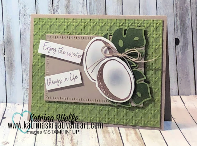
Today I have a fun card to share with you still featuring the Sweet Citrus Bundle. This time, I just inked up the "half" citrus image with Soft Suede ink and once I had them die cut out, I used my mini Blending Brush to add a small amount of Smoky Slate to the center to give the appearance of a concave center creating a coconut. The embossing folder used here is found in the 2023 January to April Mini catalog as well. It's the Cane Weave 3D Embossing Folder. I also mixed in a couple of Online Exclusive  product, the Tropical Leaf bundle and the Radiating Stitches dies. 

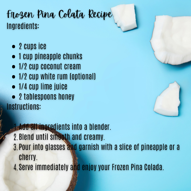
And, since it's FriYAY and it's 5 O'clock somewhere, here's a tropical adult beverage to spice up your day! Enjoy!
pina_colada_KKH

Happy Stamping,


Product List
Smoky Slate Classic Stampin' Pad
[131179]
$6.50

March 29, 2023

Create a Quick n Simple Thank You Card with Sweet Citrus

pink_grapefruit_kkh
Hey friends,
I'm back with more inspiration using the Sweet Citrus bundle. I love that I can make lemons, limes, oranges and PINK grapefruit from this fun set. Who else LOVES pink grapefruit? I lived on this stuff in high school, of course I believe back then (it was 1980 something) grapefruit and grapefruit juice where said to be "fat busters" blah blah blah...so like all teenage girls I decided I needed this miracle fat buster...now...I wish I was high school "fat" lol. Anyhoo, I used Flirty Flamingo and Daffodil Delight and the sentiment, I stamped on a little peek at the Radiating Stitches dies. It's just so FUN!
So, later today Stampin' Up! will be announcing the color refresh for the 2023 Annual Catalog and will be posting the Last Chance List and for demonstrators, the digital catalog. I won't be able to share the catalog with you, but I will be sharing the color refresh and last chance list with you over on my Facebook Page, so if you don't follow me there, be sure to head over, like my page and turn on notifications so you know when the hot off the presses information is posted. 
Happy Stamping!


Product List

March 27, 2023

A Quick n Easy Treat Box - Perfect for Easter or Anytime!

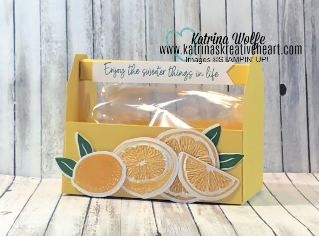
Lemon_garden_toolbox_kkh

Hey friends,

Thanks so much for coming to hang out. Today I have a super cute, quick n easy treat box that looks much like a garden toolbox to share with you. My box features the Sweet Citrus bundle from the 2023 January to April Mini catalog, however, you could definitely change this up with Spring florals or a cute little bunny (the bunny punch is due back Mid-May!)and it's large enough to hold a lot of jelly beans, chocolate eggs, even a couple of hard boiled Easter Eggs. Here, I filled my treat box with Lemon Heads candy to keep with the lemony theme. 

The measurements for this box are as follows:

Base is 8" x 6" scored at 1 3/4" on all 4 sides

The Ends: 2 pcs 2 1/2" x 3 1/2" (mark 3/4" in on one end from the top and from the side, then cut on the diagonal from mark to mark to achieve the shape)

Handle: 5 1/2" x 2 1/2" Score with the long end at the top at 1/2" and at 5", turn and score at 1/2", 1", 1 1/2" and 2"

I hope you enjoyed this fun little treat box and can't wait to see what you do with it. \

Happy Stamping,


Product List

March 24, 2023

An easy layout that keeps your Beautiful DSP Front and Center

Legendary_Ride_Angle_Cut_DSP
Hey friends,
Thanks for stopping by my little corner of the web. 

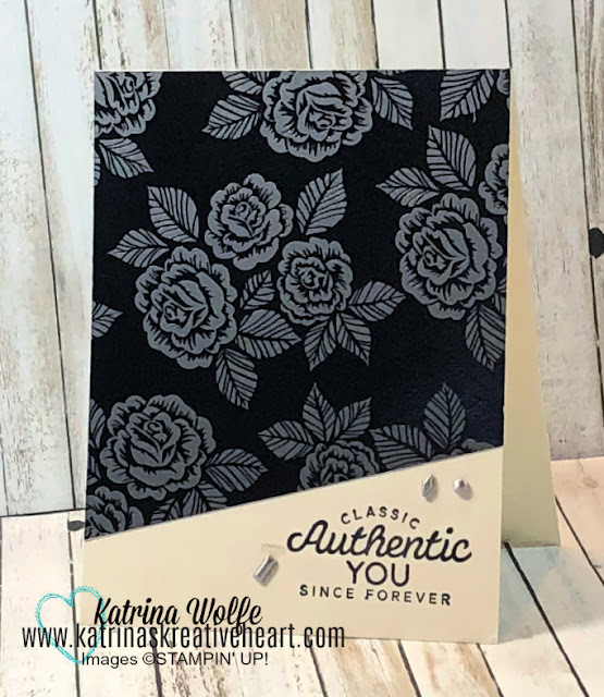
Sometimes, the DSP is just so beautiful, you have to make it the star of the show. And this DSP is a perfect example of just that. This gorgeous DSP is a part of the Ready to Ride 12" x 12" DSP. The glossy black foil with the silver/gray embossed roses just make me smile and I wanted this paper to shine...pun intended. So to keep this DSP front and center, I decided to only use a sentiment from the Legendary Ride stamp set using Memento Tuxedo Black ink to stamp it. I cut a small angular section from the DSP to allow enough room for the sentiment and adhered it to the card front. To finish the card off, I added a few of the silver toned Adhesive Backed Studs. 

I hope this inspires you to pull some of your favorite DSP and make it the star of your next card making session. Pair it up with a nice sentiment and maybe a few small embellishments and I bet you'll have no regrets for cutting into that pretty paper!

Happy Stamping,


Product List
01 09 10 Code line 7 9 is for loading jQuery library. Remove this line if you’ve already loaded it somewhere else in your blog. Hint: If your blog has an image slider, carousel or something with fading effect running, chances are it is powered by jQuery. If this widget doesn’t work, the first thing you want to do is comment out or remove this line. To use your own button, replace the URL in line 3 with the direct link URL to the image. Make sure to keep the quotes. To reposition the button, replace