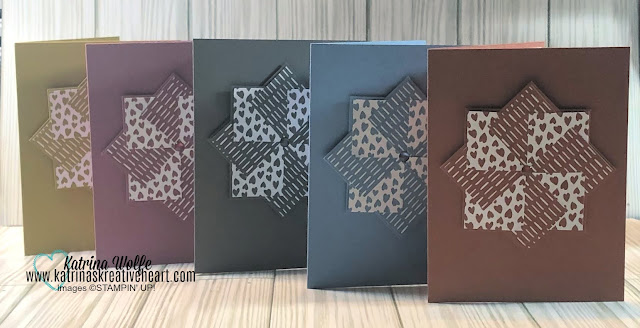
Handmade greeting cards are a wonderful way to show your loved ones how much you care about them. Whether it's for a birthday, anniversary, or just to say hello, a handmade card can bring a smile to anyone's face. However, one of the most important aspects of making a greeting card is choosing the right colors. In this article, we'll explore some tips for effectively choosing colors when creating handmade greeting cards.
Consider the Occasion
The first step in choosing colors for your handmade greeting cards is to consider the occasion. Different occasions call for different colors. For example, a birthday card might have bright, cheerful colors, while a sympathy card might have more muted tones. Think about the message you want to convey with your card and choose colors that support that message.
Choose a Color Scheme
Once you have an idea of the occasion and the message you want to convey, it's time to choose a color scheme. A color scheme is a set of colors that work well together. There are many different color schemes to choose from, such as monochromatic (using different shades of the same color), complementary (using colors that are opposite each other on the color wheel), or analogous (using colors that are next to each other on the color wheel).
Think About Contrast
Contrast is an important aspect of choosing colors for your handmade greeting cards. Contrast refers to the difference between light and dark colors, as well as between warm and cool colors. Using contrasting colors can help make your card stand out and draw attention to important elements, such as the text or a specific design element.
Consider the Recipient
When choosing colors for your handmade greeting cards, it's also important to consider the recipient. Think about their personality and their favorite colors. If you're not sure, you can always ask them or do some research to find out what colors they like.
Test Different Color Combinations
Finally, it's important to test different color combinations before you start creating your card. This will give you a better idea of how the colors will look together and help you make any necessary adjustments before you start working on the final product. You can do this by creating small color swatches and placing them next to each other to see how they look together.
In conclusion, choosing colors for your handmade greeting cards is an important part of the creative process. By considering the occasion, choosing a color scheme, thinking about contrast, considering the recipient, and testing different color combinations, you can create beautiful and effective greeting cards that will bring joy to your loved ones.
I hope you found this helpful. Happy Stamping,


No comments:
Post a Comment