July 13, 2025

Coneflower Celebration: Simple Cards with Summery Charm


We might be melting up here, but the creativity is in full bloom! This week’s Sunday Live was all about the gorgeous Coneflower Celebration bundle—available now as part of the Online Exclusives—and I’m smitten. Coneflowers are some of my favorite real-life blooms, and these stamps and dies captured that sunny, rustic charm beautifully.

🌼 Card 1: “You Made My Day”

We started with a cheerful card using Darling Duckling cardstock and Calypso Coral Designer Series Paper. The star of the show? That big, beautiful coneflower, colored with a mix of:

  • Light & Dark Calypso Coral

  • Light Darling Duckling

  • Deep 200 (for the cone)

  • Light Old Olive (for the leaves and stem)

We added linen thread, dimensionals, and a few rhinestones to bring it to life. Simple, quick, and oh-so-happy.


🎉 Card 2: A Belated Birthday Fun Fold


Next up was a layered coneflower card using Timid Tiger and Darling Duckling with a vertical fun fold. The flower features stamped petals layered over the large cone die, and I used the same Blends as before to keep things cohesive.

We stamped the sentiment “Happy Belated Birthday” on the base and added subtle depth by doubling up on the flower center. It's the perfect mix of sweet and sassy!


🦋 Card 3: Embossed Elegance + Butterfly


Finally, we played with a brand-new favorite: the Sunflower 3D Embossing Folder (part of the July Online Exclusives). I embossed a piece of Peach Pie Two-Toned Paper, then gave it a light sanding with a sanding block for a distressed, vintage vibe.

We wrapped linen thread, added the heartfelt sentiment “I love that I’ve known you for so many birthdays,” and finished with a fussy-cut butterfly, colored with Light Calypso Coral and Light Darling Duckling.

💌 Want to Recreate These?

Download the FREE project sheets here — each card includes measurements, supplies, and step-by-step instructions.


🛎️ Don’t Miss:

  • August Paper Pumpkin: Farmhouse Florals → Subscribe by August 10

  • Circle of Seasons Add-On Dies → Exclusive to Paper Pumpkin subscribers

  • Virtual Album Retreat → July 16–18 (hosted by Stampin’ Up!)

  • Sunrise Sailing Card Class → Registration closes July 15!

Thanks again for crafting with me, friends. I love sharing these Sundays with you—and I can’t wait to see what you create next.

Until then, happy stamping!
💛 Katrina

July 9, 2025

Elevate Your Cards with Simple Texture Techniques


If you’ve ever looked at a handmade card and thought, “Why does this look so polished?”, chances are the answer is texture. Adding texture is one of the simplest ways to take your cardmaking from flat to fabulous—and you don’t need fancy tools to do it. Here are some easy techniques that add tactile interest and depth to your projects.


💨 1. Embossing Folders: Instant Dimension

Embossing folders are one of the fastest ways to create an eye-catching background. Whether it’s bricks, florals, or subtle polka dots, that raised texture brings your cardstock to life. For extra drama, lightly sponge ink over the raised areas to make them pop.

Tip: White-on-white embossed panels add elegant, understated texture perfect for wedding or sympathy cards.


✂️ 2. Layered Die Cuts

Using multiple layers of die cuts (especially with sentiments or shapes) adds both visual interest and a subtle 3D effect. Simply stack two or three die cuts together with liquid glue.

Bonus: Try one layer in vellum or foil for added contrast!


🎨 3. Ink Blending & Splattering

Blend ink on your card base using blending brushes or sponges to create a smooth gradient. Add splatters with water or diluted ink to give your background more texture without adding bulk.

Pro Tip: Metallic watercolor splatters are gorgeous for holiday cards or evening-themed designs.


💌 4. Tearing & Crumpling

Sometimes, imperfection adds charm. Try tearing the edge of your patterned paper or gently crumpling a paper layer, then smoothing it out for a vintage, distressed look.

Great for: Junk journal-inspired layouts or shabby chic designs.


🎀 5. Ribbon, Twine, and Embellishments

Even a simple strand of twine or a stitched ribbon can elevate a design. These tactile elements give your cards warmth and character—and they’re a great way to use up those little leftovers in your stash.


Final Thoughts

Adding texture doesn’t have to mean adding bulk—or stress. Start with one technique, experiment with combinations, and watch your cards come to life in a whole new way.

What’s your favorite way to add texture to a card? I’d love to hear it—drop a comment or tag me in your next post!

Happy crafting,
Katrina 💖
Katrina’s Kreative Heart

July 8, 2025

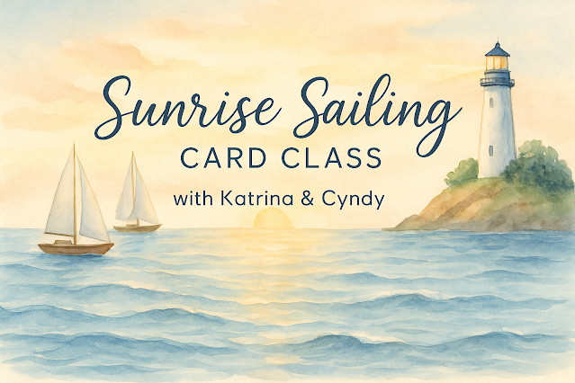
Sail Into Summer with the Sunrise Sailing Card Class ⛵


 I’m so excited to announce a brand-new card class that’s perfect for summer—and I’m teaming up once again with my sweet friend Cyndy from Stamping the Wilde Way to bring it to you!

Introducing the Sunrise Sailing Card Class—a breezy, coastal-inspired class featuring the Sunrise Sailing Bundle from Stampin’ Up! This class is packed with soft summer tones, nautical vibes, and simple techniques to help you create four beautiful handmade cards.

Here’s What’s Included for $45:

  • Pre-cut card kits to make 4 coordinated cards

  • Half pack of the 2025–2027 In Color 6"x6" Designer Series Paper (20 sheets!)

  • Full package of the 2025–2027 In Color Flat Pearls

  • A PDF tutorial that includes color photos, step-by-step instructions, measurements, and a full supply list

  • Shipping to your door—yep, it’s all included!

This class is perfect whether you’re brand new to card making or a seasoned stamper looking for some summer inspiration.

What You'll Need:

To complete the class as designed, you’ll want to have on hand:

  • The Sunrise Sailing Bundle (or substitute a similar nautical set)

  • Ink pads in Versamark, Darling Duckling, Petal Pink, Timid Tiger, Secret Sea, and Cloud Cover Ink Refill + an uninked Stampin' Spot (optional)

  • Adhesives: Stampin’ Seal, Dimensionals, and your basic paper crafting tools like a paper trimmer, snips, die cutting machine, and blending brushes

Important Dates:

  • Registration Closes: Tuesday, July 15, 2025

  • Kits Ship By: Wednesday, July 30, 2025

Just Want the Tutorial?

If you already own the bundle and supplies and prefer to use what you have on hand, you can purchase the PDF tutorial only for $20.

A Special Gift for My Team

If you’re a member of my Kreative Hearts team, this tutorial is FREE for you on August 1st as part of your exclusive team perks!


📬 Ready to set sail?
Click here to register now!

Let’s kick back, craft, and cruise into creativity together—this is one summer class you won’t want to miss!

Crafty hugs,
Katrina Wolfe
Independent Stampin’ Up! Demonstrator
Katrina’s Kreative Heart

July 6, 2025

Bee-autiful Cards with the Meant to Bee Bundle 🐝

 Happy Sunday, friends! I hope you had a fabulous 4th of July weekend. Ours was full of food, family, and fun at my sister-in-law’s house—she really knows how to throw a picnic! 🎆

Despite the summer heatwave (hello, melting craft room), I powered through to bring you three adorable cards featuring the new Meant to Bee bundle. Here’s a quick look at what we made:


🐝 Card 1: We Are Meant to Bee


We started with a thick Basic White card base and layered on die-cut octagons in Bubble Bath, Petunia Pop, and Old Olive. A touch of texture from the Exposed Brick embossing folder added extra dimension, and of course, our little bee stole the show—complete with stripes, wings, antennae, and a sweet smile. 💕

💡 Technique Tip: I used a rubber glue brush for clean adhesive placement on the delicate frame shapes—so much easier than fighting with adhesive sheets on a humid day!


🐝 Card 2: Love This Life


This card was inspired by a sketch I found on Pinterest from Operation Write Home (an old favorite!). The Bubble Bath card base got a pop of cuteness with the Cute As Can Bee DSP and a simple sentiment strip stamped in Memento Black. A trio of starburst sequins added just the right sparkle. 🌟

💬 Quick and simple = perfect for busy crafters!


🐝 Card 3: Our Hive


For this one, I used a Pool Party base and added a floral pattern from the same DSP pack. The sentiment “Our Hive” was built with layered die-cut words, and our bee buddy buzzed into the corner to complete the look. A couple of sequins and voilà!—card #3 done and dusted.

Click the title of each card to grab the downloadable/printable tutorial.


🎁 Get the Class Free

You can get all the materials (pre-cut paper & embellishments) for these three cards FREE with a $35 order in my online store. I accidentally listed $35 instead of $40 on Facebook—so I’m honoring the lower price for you!

You’ll need the Meant to Bee bundle (or substitute something from your stash), but everything else is included.


🌅 Sneak Peek: New Class Coming!

Keep an eye on your inbox tomorrow for the official launch of my next class: a Sunrise Sailing collaboration with my talented friend Cyndy Wilde from Stamping the Wild Way! If you’ve been looking for masculine card inspiration, this is the one.


That’s all for now—thank you so much for hanging out with me during this sticky July Sunday. Until next time, stay cool and keep crafting! 🐝💛

With creativity,
Katrina

July 4, 2025

Sun-Kissed Creativity: Summer Themes in Paper Crafting


Summer is the perfect time to infuse your paper crafting with sunshine, color, and fun memories. Whether you're making cards to send warm wishes or documenting beach days and BBQs in your scrapbook, this season offers endless inspiration.

Card Makers:
Try incorporating pastel palettes like aqua, coral, lemon, and peach into your designs. Use heat embossing for shimmering sun effects or layer textures with embossing folders and die cuts for seashells, flip-flops, and tropical leaves. Fun folds like the waterfall or easel card can mimic the playful, laid-back vibe of summer.


Scrapbookers:
Create dynamic layouts using washi tape waves, photo corners shaped like sunglasses, and journaling cards that look like polaroids. Layer DSP that resembles sand or waves with stamped elements like sunbursts or picnic baskets. Bonus tip: use vellum to soften bright photos and add a dreamy, sun-faded look.

I hope these ideas spark your creativity. Stop by Facebook and share what you're working on, I'd love to see.

Happy Stamping,

Katrina 
Katrina's Kreative Heart

July 2, 2025

5 Color Theory Tricks Every Cardmaker Should Know

 When it comes to cardmaking and paper crafting, color isn’t just decoration—it’s the secret sauce that brings your designs to life. But choosing colors can be overwhelming, especially with so many beautiful inks, papers, and embellishments available. That’s where color theory comes in to save the day. Here are five easy color theory tricks that will help you create eye-catching cards with confidence.


🎨 1. The Power of the Color Wheel 

The color wheel is your best friend. It’s more than an art class relic—it helps you find combinations that just work.

  • Complementary colors (opposites on the wheel) like blue and orange create bold contrast.

  • Analogous colors (neighbors on the wheel) like pink, red, and orange blend beautifully for a soft, harmonious look.

  • Triadic colors (three evenly spaced) like red, yellow, and blue give a vibrant, balanced effect.

Try pulling out a color wheel next time you’re stuck—your design will thank you!


🧁 2. Use the 60-30-10 Rule

This simple formula keeps your color balance on point:

  • 60% main color (like your card base)

  • 30% secondary color (mat layers or embellishments)

  • 10% accent color (sentiments, small pops, or bling)

This trick gives your card a professional, polished finish without feeling overwhelming or dull.


🌈 3. Go Monochromatic

Monochromatic doesn’t mean boring—it means cohesive. Choose one hue (like purple) and use light, medium, and dark shades.
It’s perfect for elegant, calming designs and great when you want to highlight textures or techniques like embossing or layering.


🧃 4. Neutrals Are Your Secret Weapon

White, black, gray, kraft, and even metallics like gold or silver are considered neutrals in paper crafting. Use them to break up bold colors or to ground a busy design.
Don’t forget: a simple white-on-white card with texture can be just as striking as a rainbow masterpiece.


💡 5. Let Your Paper Inspire You

Not sure where to start? Look at your favorite Designer Series Paper! Stampin’ Up! does the color coordination work for you—just pull a palette from the paper’s color list and use it as your guide.
No guesswork, all wow-factor.


Final Thoughts

You don’t need an art degree to use color like a pro. With these simple tricks, you’ll start to see color differently—and your cards will reflect that extra touch of magic.

Now it’s your turn: what’s your favorite go-to color combo? Drop it in the comments or tag me in your next project on social—I’d love to see what you’re creating!

Happy crafting,
Katrina 💖
Katrina’s Kreative Heart

Product List
01 09 10 Code line 7 9 is for loading jQuery library. Remove this line if you’ve already loaded it somewhere else in your blog. Hint: If your blog has an image slider, carousel or something with fading effect running, chances are it is powered by jQuery. If this widget doesn’t work, the first thing you want to do is comment out or remove this line. To use your own button, replace the URL in line 3 with the direct link URL to the image. Make sure to keep the quotes. To reposition the button, replace